Python: Plotting data containing date format
In the previous tutorial (please go to Python: Pandas DataFrame data manipulation), you learned how to manipulate a huge amount of data. You learned how to import a text file, how to copy a DataFrame to another, how to remove one or several columns and rows, as well as, how to get data according to a certain condition.
Before we start, I will just write the needed Python code for this exercise from the previous one.
#Importing library
import pandas as pd
#Getting data from the text file
df = pd.read_csv('vaccinations.txt', header = None, skiprows = (1), sep = ',', quotechar = None, quoting = 3)
df.columns = ['Country','Country iso code','Date','Total vaccinations','People vaccinated','People fully vaccinated','Total boosters','Daily vaccinations raw','Daily vaccinations','Total vaccinations per hundred','People vaccinated per hundred','People fully vaccinated per hundred','Total boosters per hundred','Daily vaccinations per million','Daily people vaccinated','Daily people vaccinated per hundred']
print(df)
#Getting data per country
country = input('Please type your country of interest:')
df_country = df[df['Country'] == country]
print(df_country)
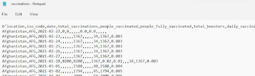
If we run this code, we will notice that the 'Date' column is of type object, as seen below:

Now, we will learn how to plot date data. For this purpose, we will convert the 'Date' column from an object type to a datetime type. The datetime format will help get a better plot.
#Converting date to datetime format
df_country['Date'] = pd.to_datetime(df_country['Date'])
df_country.sort_values('Date', inplace=True)

Python has a library named matplotlib.pyplot which is used for plotting purposes. Once this library is imported, we can choose the plot style.
#Importing library
import matplotlib.pyplot as plt
#Choosing the plot style
plt.style.use('seaborn')
Now, we must set the x- and y-axis values. We will plot the number of people fully vaccinated on time for the country specified by the user.
#Setting the axis values
x = df_country['Date']
y = df_country['People fully vaccinated']
Once the axis values are defined, we can start plotting. For this, we will give the date format to the x-axis. In order to do so, the library dates from the matplotlib library is needed. We will also set names to both x- and y-axis, as well as, to the graph.
#Importing library
from matplotlib import dates as mpl_dates
#Making the graph
plt.plot_date(x,y)
#Giving date format to the x-axis
plt.gcf().autofmt_xdate()
date_format = mpl_dates.DateFormatter('%d-%m-%Y')
plt.gca().xaxis.set_major_formatter(date_format)
plt.tight_layout()
plt.xlabel('Date')
plt.ylabel('People fully vaccinated')
plt.title('Vaccinations')
plt.show()

Then, the final Python code will look like this:

Congratulations! Now, you are also able to plot data containing date format! You are getting a Python expert. Keep learning!

Comments
Post a Comment